Thursday, December 17, 2009

End of Year Stretch

So, things aren't happening in the way that I expected them to this month. Not that anything usually does. This time it's nothing really bad, just that things will be switched around a bit. Starting off:

Desert: It's been pushed back. The holiday rush has proven to take a toll on all three of us involved (Me, Jake, and Joe). It's not certain how much time everyone can devote to this project while our jobs all take a firm grasp on our throats, so I'm kind of playing it by ear. I'm hoping that me and Jake can have a concept fleshed out by the beginning of the year, and then the more detailed sketches can come by mid January, which is when I hope to start on full production. It's a whole month behind where I thought I would be, but I don't think that's terribly bad, considering that I wasted a whole year on the TF2 project. Here's how the process goes in my head:

1) Me and Jake decide on a general concept. Stuff like where the setting is, the story behind it, a general discussion on how it looks. Not too grounded on details yet. Rough sketches from Jake will accompany this.

2) Me and Jake solidify what we want, and then him and Joe start sketching more detailed stuff, but still probably nothing too insanely detailed. I guess it kind of depends. I'm basically gonna take what I can get. If it's all super detailed, great. If not, I'll fill in the blanks.

3) I start on full production. I will probably work myself like a beast and hope that it gets done by mid March.

In the meantime, I'll be reworking Chernobyl and the laser gun. So, as you can see, I switched the order in which I'm doing things. I have roughly one month of having nothing really big to do with the desert project, so it gives me time to rework the other stuff, and if I'm feeling lucky, maybe I'll even get to rework the website.

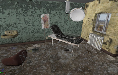
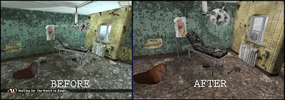
Here's a sample of what I've done so far (right) compared to how it looked before (left). I think you'll see quite a difference.

Seriously though, it's like comparing the PS2 to the PS3. No comparison. Richer colors, better composition, better details, better materials, everything. It's mainly thanks to Unreal's new SDK (software development kit) that they released. After the gun was done, I did some relearning on my unreal editor skills, when I stumbled upon some information that said that Epic Games released their full version of the development tools they used to create Gears of War and Unreal Tournament. Naturally, I replaced my crappy version with it, and viola! More creative options! The big one is their new lighting system, called lightmass. It simulates how the lights in your scene interact with surfaces. It simulates how light bounces around, and bleeds colors onto each other, etc. All kinds of stuff that makes it look more realistically lit. Also, I redid the texturing on the ground, moving objects closer together, and completely revamped the medical lamp. Then, I added in some high contrast in Photoshop, which accurately represents how it will look when I run a contrast filter for the video.

And also, the Global Game Jam is coming up again. Hopefully, it will be alot better than last year's, which those of you that read my facebook stories will know, is pretty easy to accomplish.
It's at the end of January, so I'll keep you posted on any developments.

Tuesday, December 8, 2009

Laser Rifle is Complete!

I always find this part of my portfolio work very exciting. I'm proud of myself for getting my last project done, and I'm also excited to get moving on the next one. I must say that with some victory Chipolte in my stomach, I am also excited to take the rest of the day off and catch up on some Team Fortress 2, Left 4 Dead 2, and Modern Warfare 2 (Apparently I like sequels?). As I said, the normal map is what caused the most problems as far as time goes. The diffuse map took me about half a week to do, and the specular and transparency maps literally took only about two hours. It's always discouraging when only the diffuse or only the normal map is applied to the object, because without all the textures applied, it looks crappy. When they are all working together harmoniously, it really makes me think that maybe I do have a clue with what I'm doing. :) I was a bit late on this one, but not by much considering what I learned from it. I originally wanted to have it all done by Thanksgiving, but instead got it done today, which is about a week and a half late. With all that I've taken from this project, that amount of time seems very, very trivial.

BOOM. There she is. One thing I must first of all say is that I learned one huge lesson with specular and normal maps in Unreal. Lighting is king. If your lighting sucks, then you won't see bump details or any kind of glossiness on your stuff. I feel dumb for not seeing it before in the Chernobyl project, but the lighting definitely needs to be reworked in order for more details to show. Since I didn't have any reflection map to work with on this one, i made up a fake reflection in the diffuse map. Combined with specularity, I think it works well.

Here's another closeup of the ammunition holder. I had problems with getting the batteries to look like they're behind some glass, so i faked it by lightening them in the diffuse map, and adding specularity to the transparent glass covering it. The "fan hole" or whatever you call it was added last, without any problems. It bumps nicely and has some good depth to it. I actually used my external hard drive as a reference for painting in the scuffs marks on the silver metal surface, which was a happy coincidence that it happened to be laying on my desk while I was pondering how to treat it. I really had to battle the specularity on the black wiring. It was coming across as having a way too strong shine to it, so I had to tone it down alot. Unreal definitely takes the grayscale value of the specular map differently then Maya. It seems to be much pickier.

I'm really happy with with this one. It's definitely one if the more realistic looking things I've made. Just like the wiring and many other things on the model, specularity was a battle. The dents from the normal map seemed to get swallowed up by the color detail and I was starting to get worried that it wouldn't show. Once the specular map came into play, it was no longer an issue. Just another example of how everything works together.

And the scope. I really struggled in my head with getting the wear and tear to really show on it without totally knocking you over the head with it. I cut back on some of the edge chipping compared to before and made the scratching minimal. Just so that you could JUST see it. I had to make the specularity almost not show up at all in order to make it look like metal. It seems that unreal REALLY likes to make cylindrical objects shine, so that was probably the hardest part with the spec map.

And last but not least, the improvised part. As you can tell from the conceptual picture, the knobs on the trigger were on the opposite side. After talking it over with Jake, it seemed that it would work better on the other side, so that the detail was more spread throughout the model. It worked in the conceptual sketch, but on a rotating model, well, that's different. The extrusions on the ammunition box were improvised due to there only being one side showing in the sketch. So, once again I took inspiration from my external hard drive and filled in the gaps with what you now see here.

A few specs on the model:

triangles- 2,100 ish.
triangles on the high poly model used for the normal map- roughly 16 million, or 8 million polys.
layers for the diffuse map in photoshop- 49
size of all textures used- 2048 x 2048
time spent on pre vis- a week or so
time spent on low poly modeling- a week and a half.
time spent on UVs and texturing- a week
time spent on learning and making the normal map- a little less than a month.
time spent overall- roughly a month and a half

I am doing the same thing that I did with Chernobyl. I'm holding off on any kind of camera movement and final touches for the demo reel, just in case I change things last minute, which I'm sure I'll do.

So thanks are in order:

Jake Rynkiewicz, for of course providing the foundation in which to build upon. Without his concept work, this wouldn't even exist. God knows I can't do that stuff. ;p

Jesse Sandifer, an extremely talented 3D artist. He's the guy I mentioned that tutored me with zbrush. Without him, you can just forget about me figuring out zbrush on my own.

And finally, Joe D'amico for his support on well, everything I do. HIGH FIIIIIIIVE JOE!


And so, in a couple of days I will be posting the beginnings of the desert environment. I need to see where Joe and Jake are at with this, as I know they both work ridiculously hard with their jobs. Expect to see something soon.

Ryan out.

Thursday, December 3, 2009

New Skillsets Abound

So, I'm really happy. I mean REALLY happy. I have finally gotten a grasp on the concept of normal mapping. Not only that, but I have also gotten a grasp on actually making them (GASP!). I kinda see it like this: Imagine you are a mountain climber. You have climbed many numerous mountains throughout your life, but Everest it right in your backyard, and try as you may, you just can't muster the courage to really try to reach the top. Sure, you make tiny little baby steps here and there, but you always end up getting discouraged and going back to the other mountains. Well, that is what normal mapping has been to me until very recently. I can always get to the top now, but I can still get faster and more efficient. Okay, so my metaphors suck a bit, but you get the point. And yes, it has taken me this whole month just to get the map to work, but it's with good reason. Normal maps are ridiculously complex and hard to understand for beginners. It's also very technical, which makes those who aren't so tech savy like myself learn it a bit slower than others. It certainly doesn't help that when you google how to make them, everyone has a totally different opinion on methods. Basically in a nutshell, I thought that normal maps were a lot easier than they really were, and had to study into it more. This probably happened about 3 times throughout making it. I now have my own method that works pretty well, and future models will go a lot faster and smoother. Hey, if I have to take a month to learn one of the most important aspects of being a game artist, then so be it. Very much worth it.

So, onto the pics.

The first one is just a general view. It's pretty much how big the gun will appear in the demo reel, So the closer shots I'll be showing aren't an indication of how close you will be to it. And oh yeah, the two pieces on the bottom right are the planes used for the battery details. They will be inside the ammunition holder, behind some glass when it's done.

Here is a closeup of the ammunition holder. I'll probably add in the round metal rims for the "fan" last, just because, well, I don't know. Just because. This pic makes me realize that I need some light on the bottom of the model, now that I look at it closely. It's really amazing how easy Zbrush makes it to create these kinds of geometric details. The color mapping will make it even stronger i feel.

This view lets you see the scope in more detail. Getting the normal map details to look right on this part was probably the most difficult. Some dings and scratches here and there, as well as more geometric detail to give it more believability.

The actual wood stock of the gun changed the most of all. I originally wanted very minimal wear and tear for everything, but I thought the concept of having the gun assembled from different parts lent a cool concept of having the wood to be beat all to hell, as it's seen a different environment than the other pieces. This also gives me more of an excuse to add more eye candy detail to show off for my portfolio.

So that's it! Now it's on to the color, specular, and transparency maps, which will take probably no more than a week or two. After that it's full steam onto the desert environment.

Ah yes, the desert environment. It's the next thing that I'm going to be working on. For now, it's very early in stages of development, so there's not a lot to talk about, except that it's a desert. I'll once again have Jake Rynkiewicz on for this one, as well as my good friend Joe D'amico. They'll mainly be doing conceptual drawings to aid in getting a vision mapped out for what exact kind of desert it will be. I want this project to be something that you can actually walk around in and not worry about seeing parts that are unfinished. Simple, yet something that you will walk around in for the demo reel.

I still haven't gotten any word from Ross Scott on Civil Protection, and I don't really expect to. No hard feelings, it's probably just a mixture of him being busy with other stuff, and not having any use for someone that can't compile models for the source engine.

So hopefully this gun will be done in a week or so. Cheers!

Tuesday, October 27, 2009

UV Layout

As promised, here is the UV setup for the laser rifle. Extremely boring to those who don't know what it is or what it does. Now I'm all set to start on my first ever Zbrush normal map! I'm not sure how long this will take as it's like I said, the first one I've done. Hopefully it won't take longer than two weeks.

Also, for those who are wondering about Civil Protection, you are not alone. I emailed Scott Ross and haven't gotten a response. Basically, since I don't know how to get my models into the Source engine, I can't make stuff for him unless he finds someone who can help us with compiling them. I've been down that road before with no success, so there's not a lot I can do. He's a busy guy, so I'm not sure when he'll get back to me IF he does, that is. So it's hard to tell what will happen with that.

Monday, October 26, 2009

Laser Rifle Modeling

Well now, here it is. The actual geometry for the rifle is done. I'm really happy with the way this has turned out so far, as I'm usually a little unsatisfied with my models until the normal mapping is applied. So, I'm excited to see how much better it will look with it on. Deciding what the poly count was going to be was a bit tricky, as weapons have a different philosophy to them than the regular props I usually do. There are usually three models used for a single weapon:

1) For the first person view, a higher poly model to hold up at a close distance.
2) The model that you see other players holding, which is about mid poly range. Some games will switch it to a lower poly mesh when it reaches a certain distance from you.
3)A pickup gun mesh. You know, the one that floats around or sits on the ground for you to pick up. Usually also a mid poly mesh.

So that's the dilemma. Which do I do?

I decided to do the mid poly version, because it seems like a good compromise. Doing something too high poly might make it look like I can't conserve geometry, and a low poly version for far away distances makes it look like I can't model in a complex manner.

Once I decided to go with that, I needed an example to follow from some game. I chose Team Fortress 2, because its model viewer lets you see the exact geometry display and count. I looked for a weapon similar in complexity and found that it was twice as many polys as I had on the rifle. TF2 models are usually very low poly with it being an online only game, so my model looked extremely well budgeted. I added some geo here and there, and came to a good looking model that conserved polys where it needed to.

So now, I layout the uv's, make the zbrush model, apply it as a normal map, paint the color map, and then finally the specular map. Easy right? :P

I'll update next with the finished uv layout, which will hopefully be tomorrow. After that, it'll be the normal mapped model alongside the mid geo model with the normal map applied. That will be sometime in early November if all goes to plan.

Monday, October 12, 2009

Chernobyl is Complete!!!

Hello all, that's right! It's done. It feels really good to have something finished that wasn't either A) Rushed too much for a school deadline, or B) Incomplete due to technical issues. The normal mapping and lighting gave me some troubles, but specular mapping was a breeze. I couldn't use Zbrush to sculpt out normal maps for this project due to me not realizing that you can't do some stuff in Photoshop and some in Zbrush. Apparently, when you make a model, its entire texture has to done in one program. Which is fine, that's what this next project is about (More on that later). The book I bought helped a little bit with the lighting, but not as much as I had hoped. Mainly, I just figured it out on my own. Lighting and the way normal maps react to it is still a little shaky with me, but oh well. You can't get everything right away. Anyway, here it is folks:

Sorry about the text and player model on screen once again. I will have this cut out of the version for the demo reel. Also, anti aliasing (jagged edges) are still present, which hopefully will be straightened out for the reel as well. I went online to figure out a way to remedy it, but everybody says that anti aliasing hasn't been fixed for unreal 3. I find this hard to believe. One way or another, this will be fixed, I assure you.


Now this project is done for now, but there will probably be changes for the demo reel version. There is one object in particular that might be changed, but I'm curious if someone will notice it, so I'm keeping my mouth shut about it. Two big changes that you will probably notice are the metal piece added onto the middle of the medical lamp, and the broken glass on the window. Just little things to give it more completion.

The final product will be pretty much the same as I originally planned, with a little bit of difference:

1) A moving shot from left to right of the objects, framed similar to these pics.

2)Still shot of the left side, showing a progression of the different layers. In order of final, model and lighting only view, polycount and wireframe view, color map view, normal map view, specular map view, and a shot of the final product again.

3) The same as #2, but it's the pic of the right side of the room.

The second shot I planned out in the very beginning, I decided was unnecessary. You only need one shot to establish the room I feel. So, that's that.............NEXT!
BAM! That's the gun I will be making, courtesy of the tasty rendering you see by my good pal, Jake Rynkiewicz. Over the next week, I'm gonna take it easy to celebrate Chernobyl's completion. But I'll also be planning for this one. Expect to see some stuff by the beginning of November-ish. The finalized version of this will be a turntable that rotates the object and shows the different layers of detail applied to the model. I'm going to try to make it a ZBrush only model, so we'll see how that goes. I'm going to do some online tutoring on making geometric detail on objects in ZBrush. Basically, this guy I met on a forum says he'll make a 60 minute training DVD for anyone who wants to get better with it, and it will be completely custom made to suit my learning needs. He also seems to be very professional and legit, which is a plus. Very cool stuff. He says that he'll also give homework assignments to make sure it all sinks in, so I might have that to show even before the gun. Time will tell. Now, for some well earned celebration Chipolte.

NOM NOM NOM NOM NOM!

Tuesday, September 29, 2009

Color mapping is done!

So, I just finally hit that huge milestone where the diffuse color is done for everything. Now, I just need to learn a bunch about lighting in Unreal(Where are you, book?), and then apply the normal and specular maps. Here is the pic that I've been waiting to post for quite awhile, the finalized color mapping:


Things to excuse for now:

1) The lighting is crap. Hence, me waiting for that damn book thingy.

2) The anti-aliasing, or "jagged edges". This is a screen grab from the work window in the program. It's not from in-game. When everything is done, all the stuff you will see will be in game, complete with pretty, clean edges.

3) There are some objects that aren't technically done as far as color goes. These are special cases where the normal map needs to be completed first.

4) For those who nitpick like me, you can see a hard edge where the tiling is broken on the floor. I'm fairly certain that this is a lighting issue as well.

You may also notice that the Russian propaganda poster is gone. This is another example of having to let go of one of your babies that you love so much. Yes, I wasted a good day's worth of work to make it look good, but the medical poster you see in its place looks better. This change came about when I had my mom look at the room. This is what I like to do when I need that non-artist opinion on my work, which is just, if not more valuable. I told her to name what kind of building the room was in within 5 seconds, and she couldn't. This is a HUGE problem, because I want the viewer to know that they are in an abandoned hospital. She said that the propaganda poster looked out of place, and that they wouldn't have it in a hospital. This was something I knew before, but ignored as I thought that establishing the location as Russian was more important at the time. She suggested to replace it with a medical poster. DING DING DING DING! She had it. So I tried it, and it worked. It was that last piece needed to sell the place as a hospital. Hey, it was a bad feeling getting rid of the other, but nowhere near the feeling of abandoning CTF_Platform (the TF2 map).

So, right now I'm taking the time to relax and gather my sanity. After some Chipotle and Team Fortress 2, I'll resume work and update again whenever the lighting looks good along with the normal maps.

Friday, September 25, 2009

Greetings, comrade.

This post is just a couple snippits of what I've been doing over the past day or two. I've decided that online documentation regarding lighting in the Unreal level editor is pretty much nonexistent, minus just telling you how to place a light and adjust the brightness of it. So, I decided to buy a book on it. "Mastering Unreal Technology Volume 1", is its name, and it looks promising for 32.99. So, while I'm waiting on that to get here, I decided to finally crank out that Russian propaganda poster mentioned earlier. And I must say, I'm happy with it:

What I basically did was make the poster as if it were brand new, and then roughed out the edges and added some dirt and paper overlays that gave it its worn out look. The original design:


(The writing is Russian for "nuclear power"). Creative, I know. Also, I added the transparency map to the window glass and placed an image behind it of the infamous abandoned ferris wheel found in Pripyat. (The city that had to be evacuated due to the Chernobyl disaster, where this scene is set).


This, along with the poster, hints at the setting without shoving it down the viewer's throat too much. I guess if you don't know by the title "Chernobyl" what it's about, then these won't matter. If you do however, it shows that I've done my homework. :D The tricky part of finding a good background image for the window was all in the perspective. It had to look as if you were seeing it by looking straight at the window, and also had to be something that gave you enough of a hint at the setting. If the angle of the image would be off even slightly, it would look weird as the camera pans right.

So, hopefully when I get my book, It'll help my lighting to not look like crap. Meanwhile, I'll be working on getting some random clutter on the ground, and finishing the color mapping. I'll have this whole thing done sometime in October. That's all I know for now.

Sunday, September 13, 2009

Taking Shape

Hello all. Have you ever been in the early stages of a project and had those old, nagging thoughts that you have no idea what you're doing? Well, this is how almost all my projects go. Eventually though, I get to a point where all the pieces fall into place and I start to become happy with what I see. I have hit that point. Not to say that it's looking phenomenal yet or anything, but I think that the final product will be something to be proud of. I guess I'll shut up and show you what I mean:


As you can see, the color mapping for the room is complete. Now when I say room, that's not including any prop work, obviously. I like the way the whole color scheme is looking, as it is not too colorful for such a setting, but not too washed out also. So many games today are guilty of hiding their ability to use color effectively by desaturating everything to a muddy brown, which is something I tried to steer away from. Fallout 3 for example, has been a great reference for me as far as detailing goes, but I think they really could have played with color more. So also, you can see that everything is successfully in the engine and in real time. I have tested all aspects of the work flow required to get what I want, and everything is possible to do without too much of a headache. It's really just a matter of plugging in the remaining texture maps, adding some more decals and props to fill in space, fixing up the lighting, and viola! It's done! I'm not concerned too much with making a rigorous schedule for this, but I hope to have it done at the end of September.

As far as civil protection goes, Ross posted on his site saying that he's all moved into LA. So, hopefully in a week or so, we'll get it up and running again. I guess we'll just wait and see.

Tuesday, August 25, 2009

Arrggggh! Abandon ship, mateys!

This is more just news then actual progress, but I am giving up on the source engine. Lately, I've been going back and forth between giving it another try or just learning another engine. Over the past few days, processes would work, then randomly not work for no reason. So, despite my desire to make content for Team Fortress 2 and Left 4 Dead, I've decided that the headache required to succeed in that is no longer worth the trouble. I have no idea how Valve could have given us such an unintuitive way to create maps with a good conscience, but I will no longer try to make it work. So what am I using now? The unreal engine. I wanted to wait until I was absolutely sure that the process it uses is what I want in a workflow before I said anything to anybody. So here I am, feeling much like I learned to get around on a unicycle when I could have been using a bike the whole time. Silly me. Importing models is retardedly simple, navigation in the level editor is workable, and things actually work. No random errors, tons of programs I need to install, or lack of documentation. At least so far.....we'll see.

Also, my computer has frequently decided to randomly restart itself as of late. I'm working with my computer whiz friend to get it straightened out, though it doesn't affect my ability to work too much. More like a pain in the ass than anything really.

Some new projects might be in the works as well. Lately, I've been thinking about what to do after Chernobyl gets done. I've wanted to take someone's conceptual drawing of a complex object and translate it to 3D as a way to show off my modeling skills. I originally was going to approach someone on a forum and ask them to let me use one of their drawings, but Jake, the guy that was going to help me on the TF2 map awhile back, offered to oblige his drawing talent. We also talked about maybe doing a full level sometime in the future, but for now the focus is on the single object. Everything has been verbal so far, except for some preliminary drawings he's been doing. We literally started this last night.

What about Civil Protection? It's been put on hold for now, due to Ross moving to LA. He'll let me know when things are back on track, but I've got all my stuff completed that he originally gave me. When things get rolling again, I'll post something. Here's a link that explains his situation if you are interested: www.accursedfarms.com

Confused about what the hell I'm doing now? Here's a rundown:


Chernobyl: Currently learning workflows, programs, etc. Once things are figured out, I'll start cranking it out.

Civil Protection: Currently on hold.

Complex Object w/ Jake: Drawings are being made, talks are being had. Mostly preliminary stuff. The stuff I'm learning for Chernobyl will be applied to this as well as future projects.

Future level project w/ Jake: Mentioned, and that's it. Will be a future project.

That's all kids! DISMISSED!

Tuesday, August 4, 2009

New things in the mix

Hello all, I have some great news for you! I've on board for a new project that I'm very excited about. Barely any of you have seen this I bet, but I'll be contributing some content for a machinima entitled "Civil Protection". For those of you who don't know what a machinima is, it's basically when someone takes an existing video game's tools and content to make their own original movies. Ross Scott is the guy that creates Civil Protection as well as another machinima, "Freeman's Mind". His stuff is extremely funny, so I recommend that you check it out if you like anything associated with Half Life. He's at: www.accursedfarms.com. I think one of his videos got 500,000 hits on youtube, so my stuff will be seen by alot of people. Very cool.

So what am I contributing? I can't get into specifics until it's out, but I'll be contributing custom models as well as some custom character skins. Skins are basically the textures used for characters and models within the game engine. I'm not entirely sure when it'll be out, but let's just say that he's stepping up his game for this one, so who knows. I'll definitely let you know when it's nearing completion.

And what about Chernobyl? It won't take long to shell out the stuff for Civil Protection, and so I'll get back on track with it soon enough. I've got the base coloring for the textures done, and the normal maps for the models and environment have been planned out.I've learned a great deal about Zbrush 3, which has taken up the most time overall over the past month. There's still more to learn, but I can operate it on a level necessary to get stuff done for this project. Once I get my new 3 GB of ram installed, zbrush will be purring quite nice, as well as maya and photoshop.

Friday, July 10, 2009

Modeling progress

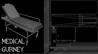
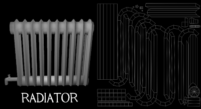
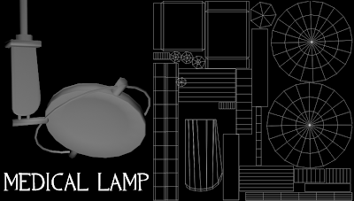
Alright, i've got all of the props for the room modeled and UV'd. It feels good to be getting back into the flow of maya and things seem to be going even more smoothly than I first thought it would. I've provided an updated playblast of the room, and also have three objects that I have decided to share and breakdown with you all.
The gurney is the starting point of this project. As you read in former posts, my first challenge was deciding what kind of an environment the gurney could exist in. I picked a reference and stayed pretty close to it throughout, as I wanted it to be immediately recognizable through silouette. (Thanks Valve!) I think it's leagues above what the old one from my reel was. Now you can look at it and know what the heck it is. The poly count is higher on it, which I don't sweat too much, as it is the centerpiece of the scene. I chose to have the seat tilted up, the wheels slanted, and to have the object's position slanted in general, to help break it up and make it more interesting to look at.
The radiator was taken from a reference picture I came across while researching abandoned buildings. It makes things look a bit more vintage-ey, but not too much. Since the room was built in the mid 80's, it would not look modern, yet not anchient at the same time. Objects like this fit just right. A lot of faces were deleted on this one, as you will never see any faces facing the wall. This cut the poly count down substantially. Once again, it is simple in design, but you can definitely spot what it is within a first glance. The faucet and piping at the bottom is extremely low poly, but it's so tiny that the player would very likely not notice it at all.
And lastly, the medical lamp. It was the same with the gurney as in sticking close to reference, while dumbing it down for poly sakes. The actual lenses on the round part will be normal mapped in, as will some details on the other parts. It's hard to judge such objects so soon, because normal maps, accompanied by great lighting, can make or break their believability. The light is meant to swivel on a rail attached to the ceiling, which is barely visible in the final shots. Getting the smoothness of the round parts to an acceptable level of quality and efficiency for the engine was tricky, but I like how it turned out.

So now, I'm gonna finally do something I've been itching to do for quite some time. I'm going to get my feet wet with normal mapping. I had bad experiences doing it in Mudbox awhile back, so I hope Z Brush is more forgiving. I'll post some pics of progress, but I'm unsure of how fast I'll get through this as I'm entering unfamiliar territory with this program. Once I get through this, it'll be smooth sailing for the most part. *crosses fingers*

Wednesday, July 1, 2009

General Layout

So, here's a rough layout of the room. So far the only things I've been focusing on are shot framing, shot timing, and getting the scale of the objects right. The first movie is of the intro shot, and the second is the last, finalized shot. Like I said, these shots are just rough layout and framing studies. They will likely change in the end, but not much.

Next, I'll start modeling out the objects, as well as laying out the uvs. Pics still to come.

Thursday, June 18, 2009

The idea.

So, after a bit of rest from the completion of Ctf Platform, I've decided to move on to a fresh, new project. I took some consideration in redoing the medical gurney from my demo reel (www.3dryan.com), and also went back and forth with other ideas in my head of what to do next. I chose to redo the gurney after some debate, but also wanted to put it into some context that makes more sense than what I did before. In the reel, it rotates on a round platform, with an abstract background behind it. This was fine for then, but one criticism that I got from it was that I should put it into a hospital setting to show how it would fit into the world around it, and not just treat it like "here's the object rotating, just for show, deal with it :p". So, I started brainstorming scenarios in which a run down, rusted out medical gurney could exist. I knew right off the bat that the environment would be an abandoned room, that it would have been left alone long enough to show some interesting wear and tear. I wanted to have a simple backstory that would explain how this could happen in a realistic, real world setting. Nothing sci-fi or fantasy oriented, but something more grounded in reality. I was looking at some reference photos of abandoned hospitals when I came across something that sparked an idea. One of the photos was that of a run down hopsital room that had the word "Chernobyl" in the file name. This reminded me of a time when my mom told me about the nuclear disaster at Chernobyl, how when a soviet nuclear reactor blew up, it poured out tons of radiation into the atmosphere, thus infecting the surrounding area, which forced a permanent evacuation of the nearby residents of the town Pripyat. The vast majority of its people have not returned since, due to the massive amounts of radiation still found there. I would highly recommend reading about the incident, as it's highly fascinating to anyone who cares about history. It's some pretty sad stuff to boot.

http://en.wikipedia.org/wiki/Chernobyl_disaster

Anyway, the setting of Pripyat makes the perfect scenario in which the abandoned hospital room will exist. Thanks to the lethal radiation, it has been left alone to the point where nobody picked up the mess. This allows more freedom for prop work, as anything is fair game to be left behind.

Who, what, where, why, how, when? Those are questions that every artist should ask before making anything that is tied to some narrative, which is most things in art, i guess. I want this room to tell a story through construction. or deconstruction, I guess, in this case. Here's some reference photos that will give you an idea for the "feel" I want to achieve:

Here's the shot setup:

1) A finalized, introduction shot that pans in on the corner of the hospital room during the day. Only the ceiling and two wall sides will be visible. The camera movement will be slow and smooth of course. The shot will have the following props as well as the title of the piece:

a. the gurney
b. wall air conditioning unit (right wall)
c. window (right wall)
d. sink (far wall)
e. laying chair
f. medical lamp (think dentist office)
g. random debri on ground (this can be wood blocks, books, scrap paper, etc.

2) A still shot of the gurney, poster, medical light, window, and radiator, in shaded wireframe view.

3) A wipe to the same shot, but with a normal map view.

4) Same kind of wipe to a color, normal, and transparency map view

5) Color, transparency, normal and specular map view (finalized shot). This is a moving shot from left to right.


That's it! I want this to be a fairly simple project. As I said in my last post, quality over quantity of objects and areas. I'll be making updates on progress through each stage, so stay tuned.

And also.....I'm going to be making a left 4 dead survival mode map, which will take me a good half year to make. I'll probably be doing a little pre-vis on it while this hospital project is underway. It will probably be a solo project, but options are still open. A small map, like I said before. You know, something I'll actually fully finish. *rolls eyes*

More on that in the future....

Tuesday, June 9, 2009

CTF Platform release day!

At long last, my Team Fortress 2 capture the flag map is complete! It's been a long time coming, 10 months to be exact. You may be a bit confused when you see the final product. Let me explain.

(If you just want to see the actual completed work, and not listen to my rant, skip ahead to the pics, design theory, and video).

This project has definitely had its road bumps. I started out highly optimistic (too much, really) that I could complete a tf2 ctf map with completely original content. I had no prior experience with the hammer level editor, which provided even more of a road block. I eventually accepted the fact that not all of my content would be original, that some Valve props would be put into the mix. Awhile after that, I decided to change the entire interior, which cut out at least a month's time. Even further down the road, I realized that I couldn't do the project on my own. So I enlisted some help, and with some hard work and long nights, i realized it was finally tangible to get the thing done by the time I move to Chicago, which is now February or March of next year. But then I took a step back and realized two very important things that would stop me from fully finishing the map:

1) I originally wanted to put this into my demo reel. Since 75% of the content would be Valve's, I would have to specify which is theirs and which is mine. This would both be ridiculously difficult to do, and would also look bad. If I were an employer looking at such a reel, I would most likely toss it, and move onto the next one.

2) Sure, I could get it done, but would it be the best thing to do over the next year in preparation for Chicago? Nope. I seemed to forget an important lesson learned from one of my teachers. Quality over quantity, always. I could have nothing to show but this finished project, but it would be smarter to work on smaller, more focused projects of higher quality. Make more varied, better made projects, rather than one watered down one.

It was probably the hardest thing I've had to do as an artist thus far, but it was the smart way to go, so I pulled the plug. I took a week off to recharge my batteries, and when I came back and looked at it, I got an idea. I realized that I could salvage the project as a level design study. I could make the level playable, but with no finished art that would make it look like an official valve map like I originally planned. It would be more like a fully functional prototype.

Overall, I don't really have many regrets on this project. I guess the only regret I have is that I wish I could have realized then what I realize now. It would have been nice to start on another project a couple months back, but maybe I wouldn't have learned as much. I've gained a pretty good understanding of how Hammer works, and I now know how to make my own levels with original content, which is something I can be proud of. But enough talk. Here's the meat and potatoes of this post, the actual work:

For those who would like to see it in motion, the video is here:http://www.youtube.com/watch?v=zlARkKMcMqY

And for those other source engine savys, the BSP is here:
http://forums.tf2maps.net/downloads.php?do=file&id=1626

The Basic Rules: It's just like any other ctf map, except there are two locations for the intelligence. The first one spawns a little outside the base, and when that one is captured, the next one spawns further inside the base. Capture it twice, and you win(Three caps total, one outside, two inside).

General Design: The problem with most ctf maps made for Team Fortress 2 is that they basically turn into fragfests due to the intel being so hard to capture, with most players giving up on actually getting it. 2Fort for example, has the intel too far into the base. Even if you manage to get it, good luck on getting back out of the base. As a result, games tend to take forever. Ctf Turbine is a much smaller map, and games tend to go faster due to the size. Still, I tend to have a problem with this map, as it's a bit too simplistic. So, this map can be looked at as a hybrid of the two. 2Fort's multiple paths and complexity, mixed with Turbine's size. A match made in heaven. Ctf Platform appears to be large when really it isn't. It just seems that way due to the many paths you can take, and that's what makes a good ctf map. The main thing, I think, is to make the intel generally easier to capture, so that games don't take forever. I do this in a couple of ways:

- Making places that are good to put sentries in, but making the areas avoidable, so that sentries don't hold so much power, a balance issue with ctf. If a sentry can block numerous paths at once, you can bet that a demoman can take it out very easily.

-Putting the intelligence room near the entrance to the base. This makes it easier to get out once you've gotten it.

-Making many paths to the intel. This makes it harder to defend, since you have to watch multiple entrances. The first capture point or "stage 1" as I call it, has 5 total ways to get to it, with 2 being reachable only with certain classes. This makes for a fast paced beginning, and really tests a team defense. Stage 2's intel has three different entry points, with one accessed only by certain classes.

-Large intel room. Open areas are harder to defend, especially with sentries. This is why the intel area is the biggest room in the base.

Breakdown of specific areas:

Neutral middle ground:

This area has a giant oil derrick plopped in the middle of it. It provides a large open area to move around for scouts, while giving enough cover so that snipers don't dominate everyone. The two buildings on the sides provide a nice little path for spies to use. The top level of the derrick is similar to 2Fort in that it allows soldiers and scouts a path to use to get the drop on the other team's first intel area. Additional tunnels are on the side that provide good flanking routes for pyros and spies. There is also a secret spot in the middle that demomen can reach. Where could that be, I wonder?

Exterior base area:

This is where the first intel is housed by a small building. The intel is very easy to reach, as mentioned earlier, and defense is critical. Walkways dot the area that take snipers to good viewpoints, on top of providing good connectivity between defense spots. Attackers can use these to get the drop, or defenders can use them to get the high ground. Two tunnels come from the sides that provide good flanking points.

Interior Base Area: There are two entrances on the left and right sides that merge the paths together again near the intel room. More walkways are present to once again place an emphasis on height advantage for either team. This leads into the large intel room that is open enough to provide at least somewhat of an advantage for the attackers. It is an uphill climb to get the intel, but an L-shaped walkway provides some high ground for the attackers as well. An underground path is accessable under the right side entrance to the base, that provides even more ground for the defenders to cover. It serves as a good route for spies and pyros, and also provides a good sentry spot, probably the best in the level. There is also an air vent that scouts and soldiers can use that takes them straight to the intel, which adds a layer of interesting complexity to defending as well.

Spawn rooms: They are made with two exit paths (one shown above), so that the defenders can get to the base entrance quickly, and to the intel room sort of quickly. This makes it so that it doesn't take forever to get to the other base, while also providing a fairly quick path to defend the intel, but not too quick, so that attackers stand more of a chance.

What's Next?: I've been in talks with some people on making a left 4 dead map next. It will be a survival mode map, mainly because they are small by nature, and it will be a lot more tangible to make a completely custom map in a decent amount of time. I will also be working on some smaller self projects along the way. More on that as they come into being.

As for now, I'm gonna lay back, relax, play some games, watch some movies. It feels good to be done at last. :)
Saturday, April 11, 2009

In my own little world, apparently.

So i figured it would be good to post an update, even if there is no real new stuff to post. I have still been working on the level as much as usual, though its been hard with having more than 40 hours of work a week :/

So I was working on the level pretty well, when all of a sudden, i felt like i needed more inspiration. Usually when I look for this, I limit my research to official valve maps. But this time, I felt that maybe a custom map or two would be good for a change. So I browsed through tf2maps.net and found a map called tc_meridian. If you haven't checked it out, I would highly recommend it, it's a beautifully made map. I also noticed that multiple people worked on it, which ignited a spark in my brain. This map made me realize two things:

1) The interior base design of my map sucked. It was really just two hallways leading into the intel room with one room in between. Very boring. I decided to go back to the drawing board. I completely cut out most of the interior, which is one those painful things you need to do sometimes when something isn't working. I'm happy to say that this is one of the best moves i've made on this project, and the level works sooooo much better now.

2) I need help. No, not like THAT. Well, maybe. But seriously, the map made me realize that having the project not being 100% made by me, might not be such a crime. This is when I decided to bring in my friend Jacob Rynkiewicz into the mix. He graduated from CCAD like me, but majored in Industrial Design. He wants to get into level design and knows quite a bit about the concepts and asthetics involved in art, so he'll be a great addition to the project. I really need to get that last little push into production, so maybe we'll hit that mark soon. Also, my friend Ryan Harlow will pop in and out to provide some models for us. That's what he does pretty much, alongside sketching characters. He graduated with Jacob and I from CCAD.

The main layout difference will be explained in greater detail later. I'm planning on learning fraps (about time) to capture the video nad narrate over it, to explain the level setup as soon as its done. Ryan out.

Monday, January 12, 2009

3D Sketching Crunch

Alright, here is that 3D sketching that I was talking about. I prefer this method over 2D conceptual sketching because like I said before, i'm not really a pencil and paper person and I think that you'll never know what looks good until its in full 3D anyway. That's just my two cents. The level is looking a lot more fleshed out, and I'm not even close to being done. Hopefully in the next few months, I will have the chops on it enough to get some color theory started on it. (Don't panic and think for one second that the colors I'm using are what the final will have, they aren't even close. They're just for distinction between shapes).

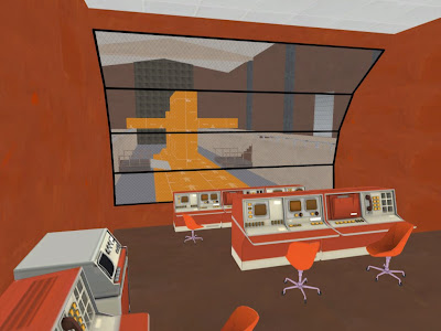
Here's how the intel room area is shaping up. The big orange block is the submarine that I posted earlier. My chairs are suffering from a case of the "having purple reflections due to the lack of having a cubemap" blues, and the control console in the back is at the bottom of some steps that are not visible due to having fullbright on. These issues will be fixed MUCH later in the process, as the level is still too rough at this point to even mess with them.

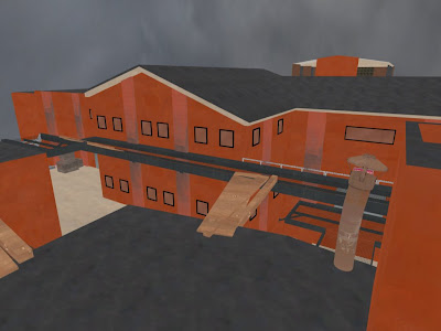
Ah yes, the exterior. I admit that I've put this off for far too long, but the red side is taking form. There is at least some differentiation between red and blue now. I'm following Valve's design philosophy of having red's base be more angular, hence the slanted roofing. I've decided that the red base will be more about technology and have more modern, sleek designs, while blue will be more industrial, and gritty. Small windows for the red side and large industrial windows for blue will help make the distinction between the two.

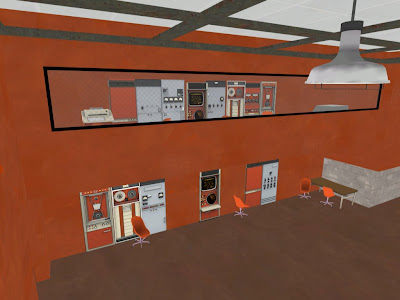
Here you can see what is meant to be a sort of observational space riddled with technology, as the red base demands to be. I came to a point in my process where I decided to use some of Valve's assets in the final, as a way to tie the level in with other Valve maps to keep it feeling like it's in the same universe. It also might have the positive effect of making less work for myself depending on how much of the assets I keep. It all depends on how much time I have in the end and whether or not I can get a chance to rework it all. It is also worth noting that the ceiling is taking shape in the form of metal framing that gives it a modern kick, while not demanding too much from the viewer's eye.

So here's the basement. I got some inspiration from Metal Gear Solid 2 in the form of handrails. There is barely anything to speak of as far as reference for oil rig interiors go, so my next best bet is interiors for oil tankers(where mgs2 partially takes place) and military ships which are pretty similar. The handrails are a very simple solution and seem to go well with the wall texture they are applied to, and make sense as long as as I don't overuse them. The two orange shapes to the left are doors, while the one to the right is the plant I posted earlier.

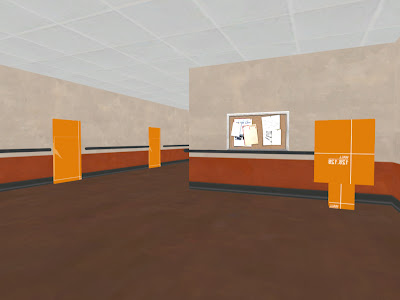
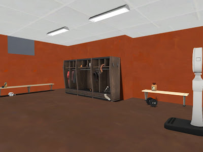
The locker room was sketched out much earlier than the other areas, as it was a test for overall spacing. It showed that I was making my spaces a bit too small, so everything got beefed up. Saved me time in the long run, let me tell you. I like the way the layout worked out for this room, maybe except for the ceiling lights. The style is perfect, but I need something larger and longer. This is an example of having that pre-made Valve model that you really want to use, but it just doesn't work for the particular situation.

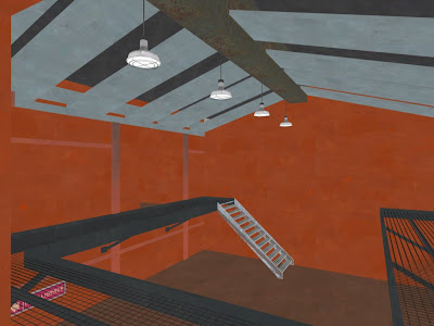
The stairs are basically final in shape. The walkways will have smaller grating, which will make them less see through. I'm not sure how the metal columns (shown as a dirty pink here) are working, but I might just be nitpicking, who knows. The walkways also have support now, and the ceiling is looking much better. It's details like this that make you feel like you're making progress :). The lights are the newest addition of all, as I'm starting to situate them at least for placement purposes, and not for actual lighting just yet.

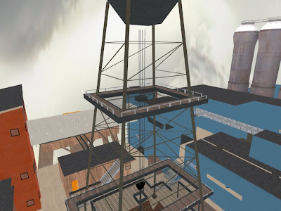
And finally, the oil derrick. What would an oil rig be without one? It serves as a good landmark to remind the player that they are in the middle of the map, which I'm guessing will be a hot zone for combat, much like 2fort. It looks much better now with at least some idea of how it will be put together. The top platform is a hidden spot that will be accessable to one class only, and I'm sure TF players will know who this is. It will give them one big advantage that is mirrored by one big disadvantage. I'm sure you can put two and two together.

This is the process as it now stands:

Pre Production
1) Current: 3D sketching and finalizing brush work.
2) Color theory application

Post Production
3) Lighting
4) Modeling (Importing models with flat lambert texture).
5) Color mapping
6) Specular mapping
7) Glow mapping
8) Normal Mapping