Tuesday, October 11, 2011

Deco Coloration


Howdy partners......

Not much new here on the home front. Just plugging away at this and that. I'm done working out the overall color layout. Things may change, but it's pretty solid.


It's kinda funny how the lighting almost looks kinda Team Fortress 2-ey. I'm thinking that its mainly due to the lack of shaders and color texture though. Hopefully. If not, then the lighting will need some adjusting. You'll notice that there's a bunch of whites and dark blues. As in, A LOT. Much of this is just transparency that hasn't been applied to the balconies yet. So everything will make a lot more sense visually when that's done.

I'm also very happy to say that I'm finally able to get a new computer! I've been looking at several options, and I'll probably know by next week what I'm going to get. Rendering out those extra millions of polys in Zbrush won't be a problem any longer. :)

Sunday, September 18, 2011

Architecturally Speaking

Okay, so I'll admit it. It was pretty freaking awesome being able to relax for a week or so after the portfolio was finally up to snuff. But, as always, I got bored pretty easily. It reminds me that I'm one of those people that starts to lose my mind if I'm not being productive. It's very hard for me to be one of those people that just goes home every night after work and parks it in front of the T.V. Needless to say, it was nice to get back into what I like to call "creation mode".

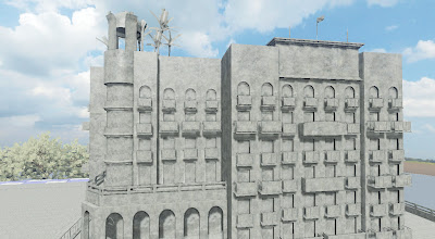
So about that art deco-ish building I mentioned. Well, I've been plugging away at it. I'm done with planning, low poly modeling, UV layout, and world building. Observe:


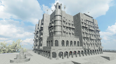
There's some key things that I wanted to achieve with this project.

1) Make a modular environment.
2) Make something architectural.
3) Make something clean looking, and not putting a crap ton of grungy detail into it.

These are all things that I think about and wonder why I haven't done any of them. But no longer!

I'm working in unreal units and exporting from Maya with the model already at the proper size, which is something I haven't done until now. Making things modular is actually pretty easy, and snapping them together in UDK is pretty painless as long as you have Maya's measuring units set accordingly.

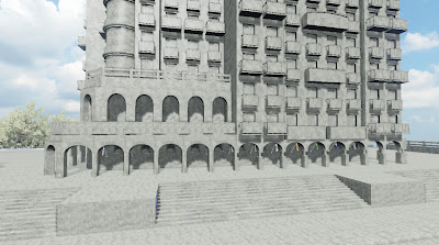
I originally didn't have the fountain, steps, guard rail, parking lot, or trees included as I thought that I could have a tighter angle that only shows off the building. This made for a pretty awful composition, so I scrapped it, and decided to put in the extra work to make more props for a wider view.

The water fountain will have water effects, with the water being handled by mostly transparency and specularity.

The overall lighting will be pretty similar to how it is now, with some tweaking most likely to follow. Especially after the texturing is done.

The trees were made fairly quickly in Speedtree and the terrain was sculpted in Maya. I tried using UDK's terrain editor, but it was giving me all sorts of problems. Basically, the terrain I generated would only appear if the camera was 200 miles away from it. Lame? Doesn't matter though. The trees and terrain are far off in the background, so they don't need to look stellar anyway.

I won't be doing a whole lot of Zbrushing this time around as I'll be testing out Crazy Bump. I must say, it's pretty awesome so far. One of the main reasons the bike took so long is that every single object was Zbrushed. It was a project I used to show that I have high poly sculpting chops. Typically, a lot of environment props will just get crazy bumped and generally take less time. As is the case with this project.

I almost wanted to do a night scene, but everything else in my portfolio is really dark/ sunset-ish. So, I opted for some daytime lighting to mix things up a bit.


So at this point, everything is set up in the editor. All I have to do is make all my diffuse, spec, normal, and opacity maps and import them in. And make adjustments to the lighting. Shouldn't take more than a month as long as my life doesn't get too hectic. Then again, I'm making trips to both Wooster, OH and Rochester, NY in October. Which will eat up some of my time as well as being generally awesome.

Sunday, August 21, 2011

New Workings of Times Past Volume Three

Hey peoples, how we all doin?

So, I decided to redo the Pripyat environment once again. Third time, I believe? The good thing is that each time the improvement ends up being huge compared to before, which lets me know that I'm improving. And that's nice.


List of improvements:

1) Lighting is the big one. Window has more of a glow to it now, which I tried to get before, but didn't know how. Shadows have more contrast, and the room is less evenly lit. SO much more atmospheric now. Lighting just wasn't doing it justice before.

2) Gurney cushion has specularity to it now, stands out more.

3) Less saturation all around. Fits the mood of the piece better.

4) Ceiling texture is improved. Texture isn't as plain as before, and there are now decals on the ceiling that help to break things up more, especially where the ceiling meets the walls.

5) Floor isn't nearly as noisy as it was. You can actually tell what's going on with the objects placed there now.


So now, a couple of things are happening for me.

First off, I'm working on a new portfolio project. It's an art deco-y building. That's all I'm saying for now. I'll have a post soon showing the first of the low polys.

I've been more active in the local games community. Didn't do enough of that in the past. Been meeting some great folks. :)

Trying to get an independent game project going. No details yet, we're in the early brainstorming stages. Should be fun.

Just gotta keep movin'.......

Tuesday, July 26, 2011

Day of Glory

Guess what folks? MY PORTFOLIO IS FINALLY COMPLETE!

That's right. It's been a LONG time coming, but that day has finally arrived. I finally feel like I'm ready to start shooting out those resumes. Huzzah. I just pulled an all nighter on the bike, just to make sure it got done. And done it is. It turned out to be even better than I could have hoped for, which is very exciting. Very exciting indeed. A definite shout out of thanks to my greatest ally Joe D'amico for coming through with an awesome concept to work off of. Thanks to you sir. And if ya'll want, you can check out the website for higher res pics. It's fancy.

www.ryansanderson.com


Without further adieu, I give you The Blue Bomber:


Texturing went a lot faster than I thought it would. When you have the groundwork laid out from the normal maps, it's surprising how fast you can work out all the other details. I tried to keep the colors mainly neutral, with some accent colors thrown in. Having certain parts of the bike painted blue, yellow, and white allows a conceptual reason for this to happen. You'll see little dabs of red here and there, but it doesn't overpower by any means. I also was trying not to put too much detail into the maps, which is a problem I've had in the past. This project taught me that sometimes less is more. There doesn't seem to be any part that overshadows another. You honestly don't want to know the total amount of layers I used in Photoshop for this project. I'm guessing at least a couple hundred.

The cardboard, toolbox, and wrench were thrown in last to help fill out the scene, and also to help with a little narration. I'm pretty proud of the lighting setup as well. It gives me some liberty to not worry about the background so much so that I can focus on showing off the bike. I didn't want to have a blank background for it to sit on, but I also didn't want to overcrowd the scene either.

You also might be able to tell that the normal mapping detail pops out more as opposed to before, with the overall lighting having better contrast. Messing with the shadows parameter in the postprocess editor helped to achieve this. However, you'll also notice that the shadows aren't as dark at the same time. With the amount of light that's hitting the bike, they were way too dark before. MUCH better now, I think.


Some wireframe pics thrown in for good measure to show that I model nice and clean. :)

Overall, the polycount comes in at 10k. Considering that this would be onscreen constantly, almost as much as the main character, I think it's just about right. I must say that I'm impressed with the amount of polys I was able to cut out. It was HEAVY before.


Since my computer is a total fail when it comes to rendering a lot of polys onscreen at once, I had to export each part out of Zbrush individually to composite all together in Photoshop. With a little shadow tweaking, it turned out pretty well.


And finally, some of my best sculpts individually rendered. The engine turned out REALLY nice. Added in some sexy blue. Who doesn't like sexy blue?


And that's it. DONE. So happy. SO HAPPY. Now, I go into work and try not to pass out. Coffee don't fail me now.....

What's next? Cover letters, cold emails, resumes, looking for a job. All that good stuff. Be on the lookout for some possible progress pics of a robot looking thingy for my RPG Meetup group.

Also need to order new business cards. Also need to shave. And get a haircut. I've been very bear-like lately.

Sunday, June 26, 2011

Color coding

This post is about you guessed it: color. The actual texture detail isn't even close to being final (a few are close though, actually). Rather, it's just a "color pass" to get an idea for how the overall color scheme will feel.

I always envisioned the painted parts being blue, with some sort of accent throughout. I ended up using yellow and white for this. Seems like they go together well. Everything is fairly neutral, with splashes of warm and cool colors here and there. I really tried to add in some subtle coloration all throughout. If you look real closely, you can spot hints of blue and green in some of the chrome, for instance. It's all about finding that perfect balance. I think I've achieved it here more than I have in the past.

And last but not least, I've finally come up with an official name for the project. Henceforth, the bike will be forever known as "The Blue Bomber". Guess what the title references, and I'll give you a dollar. No joke.

I'll post progress pics of the texturing as they come.

Friday, June 17, 2011

Fresh, normal baked goodness

Finally, I can now say that the normal mapping is done. It's most likely gonna be the vast majority of time for the project in the long run, so it's a relief to have it finished. Though I will say that diffuse mapping is gonna be pretty time consuming as well. It's funny to think that when I first started out on this project, I thought it would take significantly less time than the desert. Silly me. If you really look at it, I really have around 70 props to make total, which rivals that of Desert Straggler. Over ambitious much? Well anyway, here's some pics. UV layouts, textures, in-game normals. It's all here. I decided to split the bike into three separate props for importing into unreal. The front of the bike, the back, and the sidecar. The images for each are 2048 x 2048, which is barely enough resolution to cover all the details found in the normal maps. Not bad I must say, considering the sheer mass of parts it has.


Bike front:


Bike back:


Sidecar:


Now it's about time I dust off all these paint brushes.

Friday, May 27, 2011

Enter the Dragon (or, insert your own, more clever phrase here)

So, as promised, here's some renders of a piece I did for Casting House. It's basically a dragon design meant to go on the side of a ring. It's all shiny and stuff. In the future, I'll probably be posting more stuff from work if it's something I think looks good. I'm sure there will be others that won't. Ha.

Credit to Steven Howell for the actual ring that the design sits on.


Sunday, May 22, 2011

Details, details, details.

I must say, I really put my foot on the gas for this one. It went WAY faster then I thought it would. The detail pass for zbrushing the motorcycle is complete.

Rust, scratches, dents, welding, fading, it's all here. It's nice to know that's one major step is out of the way. I think that it was a lot easier for me to do this then adding the clean structural detail, because it's what I'm more used to doing. But, both passes come together to form a pretty solid whole, i must say. A fair warning: there's a lot of pics this time. Also, if you have a phobia of tires, I wouldn't scroll down. You've been warned.


I tried to have certain elements that repeated throughout all the pieces to help unify it all. Bolts, a lot of scratching, and welded parts are examples of this. I tried to make each object feel like it's own thing, but I also wanted all the pieces to fit nicely together. I also tried to lean away from making every single piece beat up all to hell. You won't see most of these cleaner parts, mainly because I felt they wouldn't be interesting to put up here. Nevertheless, they help out the bike as a whole.

Next up:

1) UV layout
2) normal map baking
3) setup in unreal
4) texturing
5) screen capturing, rendering, assembling for portfolio page

The UV layout and normal baking will take some time, so you might not hear from me too soon. I might post my UV layouts just for kicks, but it's German to most people. So we'll see i guess.


Also, some random stuff in my life:

I'm proud to say that I was promoted at work! I will now no longer be supporting jewelry models. I'll be helping to actually make them from now on. The best part of it is that I'll be using Maya, Photoshop, and Zbrush to do so. So that'll be awesome. I might post up a particular piece I did. So look out for that.

I beat Portal 2. It's awesome. You should play it. Like, NOW. Valve also published a digital "book" that shows what went into making it. It's pretty rad.

My parents are coming up to see me next weekend, and they're bringing me some awesome stuff. A couch, my two cats Sam and Jake, my Nintendo 64, and an air conditioner.

:)