Heya folks! How's everyone doing? Good? That's good. I've been working real hard as of late, making some pretty art. The Earthbound Winters level is all laid out, and I just got done Zbrushing all the assets that needed it. Unfortunately, I'll have less time to spend on this thing for awhile. However, the reason for this is awesome. Two weeks ago, I started up again at NetherRealm. It'll be another 9 month stint like last time, which means it'll last me until July-ish. Employment is gooooooooood. Anyway, on to the art stuff:
Drug Store Tiling Brick- A fairly simple tiling texture. I wanted it to have that almost globby painted over feel to it, with a bit of wear and tear. I exaggerated a lot of the details as I usually do. Baking a high-poly mesh down to a normal map sometimes washes out the details you need, so it's best to dial them up a bit to compensate. There's also a more plain, undamaged brick texture I'm using as well. It's not as interesting to look at on its own, so no need to show it just yet....
Brick Road Wood Planks- There are seven pieces in total that make up the entrance to the dungeon created by "Brick Road", a man who well, makes dungeons for a living. These are just a sampling of them. It's a makeshift entrance made up of these things, all hastily boarded together with nails and painted on. The overall final result isn't ready for show yet, but I'm confident it'll look just as quirky as the sprite from the original Earthbound version. It's a pretty good exercise to look at real life references and make stylized versions. Essentially, that's what I'm doing with all of these sculpts. I think a lot of the struggle comes from getting rid of / preventing high frequency detail from getting into your models. This is especially tricky when you use alphas, as they cause a lot tiny bumps to show up, which can be a huge pain to smooth out all around the entire model. It's worth it in the end though, when you achieve something that looks believable yet interesting and not just another photo realistic prop.
Cliff Face Detail Setup- I was banging my head for awhile on this one. I went through 3 revisions of the cliff face design and finally decided on this one. It's actually pretty simple and is used quite a bit in landscapes. You make a piece that has its own unique UV's, and then you make a tiling detail map that overlays on top of it. That way, you get nice close up detail while also getting the larger details that look good from a distance. It was tricky to get this mesh to fit into the existing terrain. I had to make a variant that bends around corners, two that are essentially the mesh cut in half, and one that houses a cave opening.
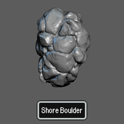
Shore Boulder- This is actually the second revision of the cliff face above. It turned out that I could use it after all on the shoreline. They made a great fit for this, and the fact that it's designed to be rotated all around gives me a lot of bang for my buck. Amazing how much mileage you can get from one prop when clever scaling and rotation is applied. :)
Stonehenge Pillars- These guys took awhile, but it was worth it. 6 pieces total. I tried to make each side look completely different so that the overall composition of stones has enough variation of shapes and detail. It's really interesting to see how different rocks look when they've been around for ages. It gives them a completely different texture then you're used to. I'm debating whether or not the moss will stay. It doesn't make sense to stay on in the middle of Winter, but maybe it'll still look good. Who knows.
Tree Trunk- This was my warm up model. It had been awhile since I last picked up Zbrush, but I was surprised with how much I knowledge I retained. It turned out really well though, and literally took forever to detail. No alpha maps here. Just good ol' fashioned sculpting. It was tricky nailing down which type of pine bark I wanted, and I must say that getting good quality reference for it off of Google is much harder than you'd expect.
And finally, some screens of the final layout. Seeing it all come together like this is what usually gives me that final push to finish a project. That feeling of "Oh my god, I might ACTUALLY get this done!". Wonderful feeling indeed. Not much to say really, it matches the layout of the original. I haven't made such a huge sprawling exterior since the Desert Straggler environment, and I'm happy to say that this dwarfs that in both quality and scale. So from here on, it's texturing (the big one, obviously), lighting tweaks, effects (new territory for me), and overall polish. You know, no big deal.


1 comment:
I love this.
Post a Comment