I'm optimistic that my demo reel will be done by mid August, just in time for the move to Chicago. Speaking of that, there's an official date set: August 22nd. Words cannot express how excited I am. The actual editing of all the video, titles, music, everything is ready to go. I decided to get it all done one weekend to kind of break up the monotony of zbrushing and texturing. I literally just have to make some video of the desert and plop it right on in. I'll also be fixing some image issues in the website with Harlow, and I might also make some behind the scenes pics to show my process. But for now, here's what I gots:
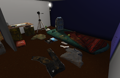
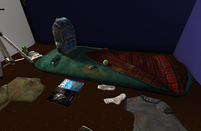
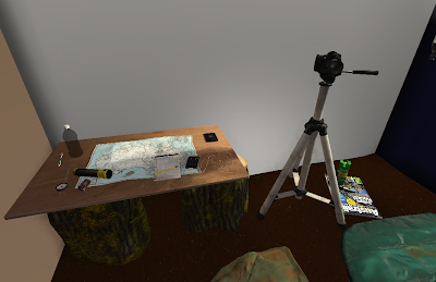 I made a bunch of improvements to the interior of the shack as you can see. I fixed some issues with parts of my normal maps fading out where light hits them. I Made a grayscale copy of their normal maps' green channel, and overlayed them over the rest of the diffuse layers. It seems like a hack, but since none of my lights are dynamic, there's really no difference to be seen except for just having more detail in general. The backpack, sleeping bag, and table logs benefited a lot from this. I also played with the specular power of some objects, which gives them a more realistic look as far as specularity goes. The plastic bottles need to be fixed material wise, but once everything around it is done, I can capture the reflection map which will make it look a lot better. I also got rid of a weird occlusion issue with certain objects, mainly the table and tripod. They were casting a weird artifact around them, but messing with some world properties straightened them out. I dirtied everything up as well, since I'm sure whoever lives there would track some dirt in there. The t shirt now has some better color choice, as does the flashlight. And most noticeable of all are the log stumps holding up the makeshift table. Pretty much everything on those are new. They were pretty bare looking until I decided some moss would look nice. Imagine them without any green. Dull, right?
 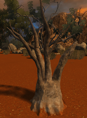 Next up is that stump thing that looked pretty bad without any texture work done to it. It has a pretty subtle texture to it, but it works. I added some sand to the bottom to make it blend in more with the ground. It looked pretty poor without it.
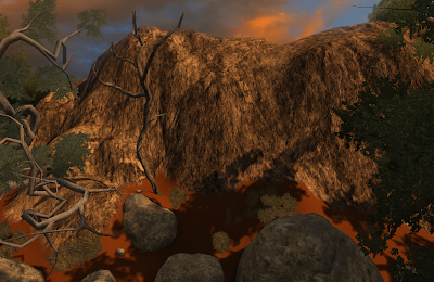
And here arethe mountains, which are improved. The old texture for it looked pretty bad, so I redid it. It uses one texture twice, one that's really big for viewing the mountain from far away, and another that tiles smaller for close up viewing. This helps break up obvious repetition of the textures, no matter what distance you're viewing it from. As you can also see, the dead tree is done. Nothing flashy here, once again subtlety works.
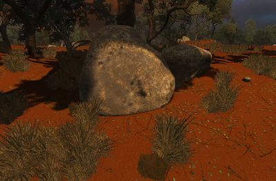 As one guy suggested on Polycount, I added some leaves and increased the amount of twigs. Finding a right amount of saturation for the leaves was tricky, as I didn't want them to look too fresh, but too much desaturation prevents them from blending in properly with everything else.
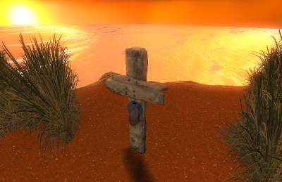 Ah yes, the grave. It was pretty simple to do. I modeled it after some reference of an old wooden sign and it has just the right amount of dirt and detail. It was tough to conceptualize how some wood carved for such a purpose would look, since he wouldn't have the best tools, but once I settled on something, it was smooth sailing.
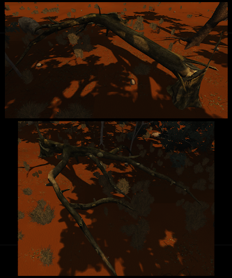
It's mostly in shadow, but the "fallen tree" as I've called it helps to break up the environment a bit. Zbrushed all to hell, this guy is pretty light at about 2000 tris. I'm pretty happy with how detailed it ended up looking.
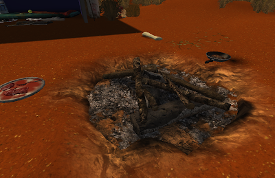 And finally, I added in that campfire area I mentioned in earlier posts. This was a bitch to do in zbrush, as I had quite a few sticks to do, and I was being a stickler on all the detail. Maybe too much for how close you get to it. Out of all the things I zbrushed, this along with the fallen tree took the most time to sculpt. I dug into the terrain a bit and put down a flat plane that would serve as the ash beneath the logs. This is definitely one of the props I'm most proud of.
That's all for this update. I've promised myself that there will only be one more final update for the desert sessions. I just really want to get this thing and looking nice. Once it is, and the website/demo reel is done, a gigantic weight will be off of my shoulders. Stay tuned...

No comments:
Post a Comment