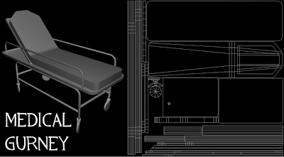
 The gurney is the starting point of this project. As you read in former posts, my first challenge was deciding what kind of an environment the gurney could exist in. I picked a reference and stayed pretty close to it throughout, as I wanted it to be immediately recognizable through silouette. (Thanks Valve!) I think it's leagues above what the old one from my reel was. Now you can look at it and know what the heck it is. The poly count is higher on it, which I don't sweat too much, as it is the centerpiece of the scene. I chose to have the seat tilted up, the wheels slanted, and to have the object's position slanted in general, to help break it up and make it more interesting to look at.
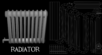
 The radiator was taken from a reference picture I came across while researching abandoned buildings. It makes things look a bit more vintage-ey, but not too much. Since the room was built in the mid 80's, it would not look modern, yet not anchient at the same time. Objects like this fit just right. A lot of faces were deleted on this one, as you will never see any faces facing the wall. This cut the poly count down substantially. Once again, it is simple in design, but you can definitely spot what it is within a first glance. The faucet and piping at the bottom is extremely low poly, but it's so tiny that the player would very likely not notice it at all.
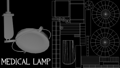
 And lastly, the medical lamp. It was the same with the gurney as in sticking close to reference, while dumbing it down for poly sakes. The actual lenses on the round part will be normal mapped in, as will some details on the other parts. It's hard to judge such objects so soon, because normal maps, accompanied by great lighting, can make or break their believability. The light is meant to swivel on a rail attached to the ceiling, which is barely visible in the final shots. Getting the smoothness of the round parts to an acceptable level of quality and efficiency for the engine was tricky, but I like how it turned out.
So now, I'm gonna finally do something I've been itching to do for quite some time. I'm going to get my feet wet with normal mapping. I had bad experiences doing it in Mudbox awhile back, so I hope Z Brush is more forgiving. I'll post some pics of progress, but I'm unsure of how fast I'll get through this as I'm entering unfamiliar territory with this program. Once I get through this, it'll be smooth sailing for the most part. *crosses fingers*

No comments:
Post a Comment