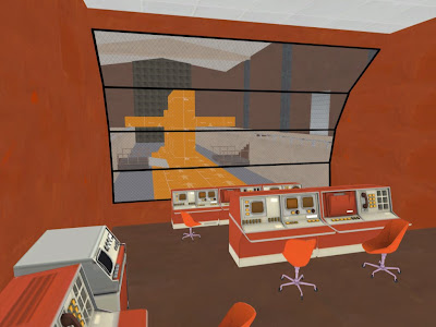
 Here's how the intel room area is shaping up. The big orange block is the submarine that I posted earlier. My chairs are suffering from a case of the "having purple reflections due to the lack of having a cubemap" blues, and the control console in the back is at the bottom of some steps that are not visible due to having fullbright on. These issues will be fixed MUCH later in the process, as the level is still too rough at this point to even mess with them.
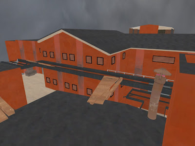 Ah yes, the exterior. I admit that I've put this off for far too long, but the red side is taking form. There is at least some differentiation between red and blue now. I'm following Valve's design philosophy of having red's base be more angular, hence the slanted roofing. I've decided that the red base will be more about technology and have more modern, sleek designs, while blue will be more industrial, and gritty. Small windows for the red side and large industrial windows for blue will help make the distinction between the two.
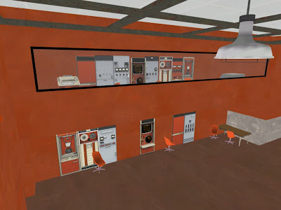 Here you can see what is meant to be a sort of observational space riddled with technology, as the red base demands to be. I came to a point in my process where I decided to use some of Valve's assets in the final, as a way to tie the level in with other Valve maps to keep it feeling like it's in the same universe. It also might have the positive effect of making less work for myself depending on how much of the assets I keep. It all depends on how much time I have in the end and whether or not I can get a chance to rework it all. It is also worth noting that the ceiling is taking shape in the form of metal framing that gives it a modern kick, while not demanding too much from the viewer's eye.
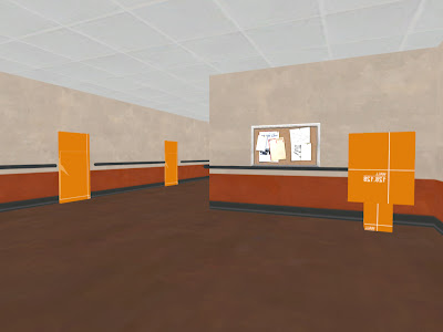 So here's the basement. I got some inspiration from Metal Gear Solid 2 in the form of handrails. There is barely anything to speak of as far as reference for oil rig interiors go, so my next best bet is interiors for oil tankers(where mgs2 partially takes place) and military ships which are pretty similar. The handrails are a very simple solution and seem to go well with the wall texture they are applied to, and make sense as long as as I don't overuse them. The two orange shapes to the left are doors, while the one to the right is the plant I posted earlier.
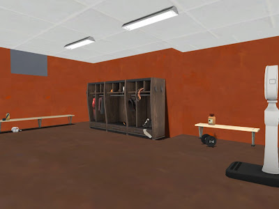 The locker room was sketched out much earlier than the other areas, as it was a test for overall spacing. It showed that I was making my spaces a bit too small, so everything got beefed up. Saved me time in the long run, let me tell you. I like the way the layout worked out for this room, maybe except for the ceiling lights. The style is perfect, but I need something larger and longer. This is an example of having that pre-made Valve model that you really want to use, but it just doesn't work for the particular situation.
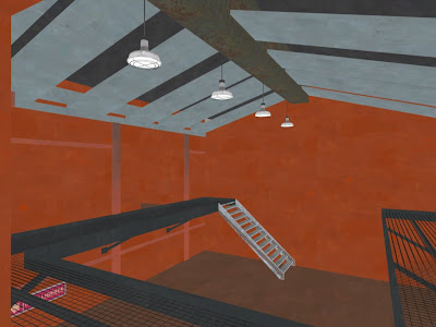 The stairs are basically final in shape. The walkways will have smaller grating, which will make them less see through. I'm not sure how the metal columns (shown as a dirty pink here) are working, but I might just be nitpicking, who knows. The walkways also have support now, and the ceiling is looking much better. It's details like this that make you feel like you're making progress :). The lights are the newest addition of all, as I'm starting to situate them at least for placement purposes, and not for actual lighting just yet.
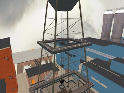 And finally, the oil derrick. What would an oil rig be without one? It serves as a good landmark to remind the player that they are in the middle of the map, which I'm guessing will be a hot zone for combat, much like 2fort. It looks much better now with at least some idea of how it will be put together. The top platform is a hidden spot that will be accessable to one class only, and I'm sure TF players will know who this is. It will give them one big advantage that is mirrored by one big disadvantage. I'm sure you can put two and two together.
This is the process as it now stands:
Pre Production
1) Current: 3D sketching and finalizing brush work.
2) Color theory application
Post Production
3) Lighting
4) Modeling (Importing models with flat lambert texture).
5) Color mapping
6) Specular mapping
7) Glow mapping
8) Normal Mapping

No comments:
Post a Comment